When autocomplete results are available use up and down arrows to review and enter to select.
Welcome! You’re in the right place to access ICBA's logos and the guidelines to ensure you are using ICBA's branding correctly.
The ICBA brand is one of our organization’s most important assets. It serves as visual identification of our products and services, and it is emblematic of our values and the connection we share with our members, state partners, and staff.
Please familiarize yourself with ICBA logo primary uses, our pillar branding, and logo Dos and Do Not’s, prior to submitting your request. All public uses of the logo must be approved by submitting the form at the bottom of this page.
Fill out request formPositive Logo Uses
The positive ICBA logo should be mostly used on white, gray or light backgrounds.
Inverted Logo Uses
The inverted ICBA logo should be used on dark backgrounds. The logomark and wordmark use the ICBA Blue and White from our palette.
Only Use Approved Artwork
The ICBA logo should never be redrawn or recreated in any way. Only use approved electronic artwork.
One Color Version
Our preferred logos are the color versions on the previous pages. The logos shown to the right are alternates that are intended for limited applications where color reproduction is not possible.
Tagline
We have a version of our logo that's locked up with our tagline: One Mission. Community Banks. This version is recommended for applications where our logo is used on applications such as third party sponsorships or merchandise where we otherwise have limited ability to tell our story.
Full Name
The Full Name version of our logo is recommended for use in applications where the ICBA initials are less known and more context is necessary.
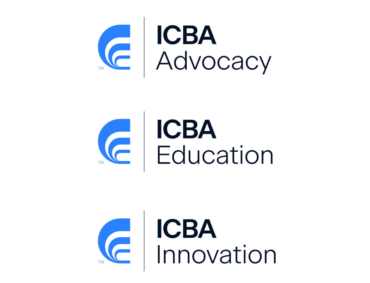
Pillar Brands
ICBA Advocacy We have three pillar logos and visual expression variations that represent ICBA's three areas of activity:
Clear Space
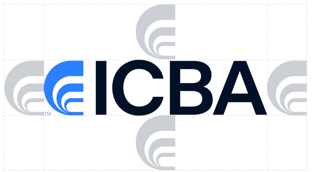
The logo needs room. It’s important that it’s clearly legible and unobstructed by other visual or verbal elements. The logo needs room to breathe.
The clear zone should be, at a minimum, equal to the height/ width of the "logomark". In all cases, please make an effort to use a larger clear zone when space allows.
Do Not's
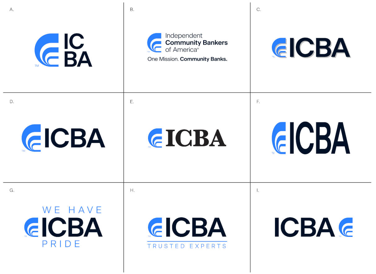
Our logo will retain its impact when used consistently. It is up to all of us to preserve its integrity and never alter it in any way. Maintaining the equity of our brand is everyone’s job.
Here are a few things to look out for:
A. Do not change the layout of the logo
B. Do not use the tagline with the full name logo
C. Do not stylize or apply any effect to the logo
D. Do not alter the proportions of the logo elements
E. Do not retype the Initials
F. Do not distort the logo
G. Do not use the logo within a phrase or sentence
H. Do not lock up any text with our logo. This includes department or product names, locations or any phrases
I. Do not change the arrangement of the elements
Brand Color Usage
ICBA Blue and our Neutral Colors should always be the most prominent in any communication. Our Pillar/Accent Colors should be used in smaller proportions and never as a dominant or background color.
RGB
Color values should be used for digital applications, such as PowerPoint and Microsoft Word.
Hex
Codes are used specifically for the web.
CMYK
Color values should be used for process color print applications.
Pantone
Color values should be used for spot color print applications.
ICBA Blue
HEX: #2B80FF
RGB: 43, 128, 255
CMYK: 75, 45, 0, 0
PMS: 2727 C
ICBA Dark Blue
HEX: #001026
RGB: 0, 16, 38
CMYK: 100, 46, 0, 89
PMS: 296 C
ICBA Gray
HEX: #DCDCDC
RGB: 220, 220, 220
CMYK: 0, 0, 0, 100 15%
ICBA White
HEX: #000000
RGB: 255, 255, 255
CMYK: 0, 0, 0, 0
Advocacy Red
HEX: #FF5050
RGB: 255, 80, 80
CMYK: 0, 84, 65, 0
PMS: 178 C
Innovation Purple
HEX: #8360FF
RGB: 131, 96, 255
CMYK: 64, 67, 0, 0
PMS: 2101 C
Education Green
HEX: #CCF86E
RGB: 204, 248, 110
CMYK: 23, 0, 73, 0
PMS: 374 C